Thursday, November 27, 2008
Tuesday, November 25, 2008
article 8
http://www.logobee.com/article1.htm
This article explains whats branding is and how you can do it better. It explains that if the design is easier than it is much easier for the eye to understand it.
This article explains whats branding is and how you can do it better. It explains that if the design is easier than it is much easier for the eye to understand it.
Thursday, November 20, 2008
Colors
- Color is the perceptual characteristic of light described by a color name. Specifically, color is light, and light is composed of many colors.
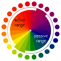
- A color wheel (also referred to as a color circle) is a visual representation of colors arranged according to their chromatic relationship.
- Colors that are across from each other on the color wheel have a relationship.
- The more object is contrasts the more its visible to the eye.

- Contrast can be formed by dark and light objects or by related colors with thick different colors.

 The color with the largest proportional area is the dominant color (the ground).
- Different values of the same color gives you shades.


Wednesday, November 19, 2008
article 7
http://www.alistapart.com/articles/whitespace
This article explains the value of white space. The white space can be called the negative space. This article explains that the white space in a picture is good. He actually says that the principle of proximity is right and free space is a good thing because it attracts the eye.
This article explains the value of white space. The white space can be called the negative space. This article explains that the white space in a picture is good. He actually says that the principle of proximity is right and free space is a good thing because it attracts the eye.
article 6
http://graphicdesign.about.com/od/elementsofgooddesign/tp/elements.htm
This article is stating the basic elements of graphic design. The article gives a brief summary for each one of the elements and it gives you links for more information about each element.
This article is stating the basic elements of graphic design. The article gives a brief summary for each one of the elements and it gives you links for more information about each element.
Thursday, November 13, 2008
Rationale
Massimo Vignelli is one of the greatest designers in the whole world. Massimo’s style is not constant so I just took some points from three or four designs and made a poster in this style. Massimo designs furniture, maps, posters, products, packaging, logos, and Architecture. His favorite color is black and you can easily see it because in each one of his designs he has at least one object in black. He is using Alignment and proximity quite a lot and you can easily see it because of the white space that he is leaving and the way he groups objects. In some of his designs he is also using contrast. My poster is based on the “knoll” poster; I used the whole idea of mixing letters in different colors and different sizes to get a word reflected. So I wrote his first name with this style; and than I took the last name and put it over the double m and the o where it could easily be seen. Because when you look at the poster your eye will finish its first round at the double m and the o; so if u put the last name there you wouldn’t miss it. In the past he designed Helvetica and introduced it to America; and that is why I used the Helvetica font.I put the main writing paragraph behind the big M letter in blue because that's what he did on his "Knoll" poster.I put just half of the letter o at the end because your eye is completing it by itself. I believe that using the font he designed in poster in his style will be the right thing to do.
Subscribe to:
Comments (Atom)
